Spenard Roadhouse Anniversary
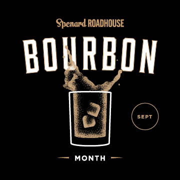
Anchorage’s history as a tent city and frontier hub inspired the identity for Spenard Roadhouse. We leaned into Alaska’s grit and resilience while adding the brand’s trademark humor—swapping the cowboy’s horse for a bucking moose.
The anniversary collateral draws from vintage western posters with bold textures, heavy grit, and offset ink for a hand-crafted feel. Paired with distinctive typography and a high-contrast palette, the result is a look that bridges frontier heritage with a contemporary edge.
Info
- Role: Art Direction, Graphic Design
- Client: Spenard Roadhouse
- Produced with: Locally Grown Restaurants
- Team: Lana Ramos